Spring Summer Color Palette 2021


Color of the spring/ summer 2021 has published by Pantone. 2021 spring/ summer has come with cool and refreshing colors.

 And this New York color palette is actually going to refresh your mind with its colors. You can create your color palette with this New York color palette form or TCX form. 

And you can also make your color palette with Adobe Illustrator. Now enjoy 2021 refreshing colors from "Spring Summer Color Palette 2021 New York Color Palette".


Spring Summer Color Palette 2021:
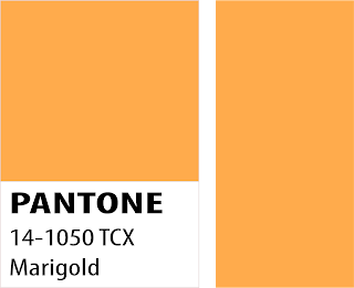
marigold


Marigold Color
Marigold color - 14-1050 TCX. A comforting golden orange-infused yellow lends a warming presence.
If you need some positivity and injection of joy, then try marigold color.
It is such a color with optimism, energy.

What color goes best with Marigold color? 
You can try Marigold yellow color palette with raspberry pink and leafy green.

How can I make a Marigold Color dye bath by own?
To do so, dye with dried marigold flowers, cover with warm water and also let them soak overnight for two days. You can also mash the flowers in the pot to break their fibers. Then strain off the flowers, and your dye bath is ready.


rust
Rust color
Rust color- 18-1248 TCX. Rust color is such an earth-inspired brown emblematic of Autumn leaves uncharacteristic of a spring palette.
What color make rust?
To make rust tone down with buffalo brown in case if you find it orange.
Then you can make rust.
What color goes with a rust color?
You should choose such combinations to stand out and which usually draw the eye.
In the color wheel, Blue is the opposite of orange.
That is why gold, rust, brown compliment shades of blue.
Spring Summer Color Palette 2021:
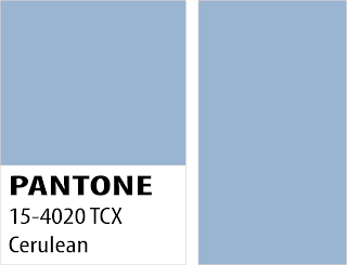
cerulean
Cerulean blue
Cerulean blue- 15-4020 TCX.

Cerulean is the color of the sky.

This color represents the calming state of mind it induces.

Since blue is known to be a calming color.

Actually, surrounding yourself with cerulean blue could bring on a certain peace.

It would remind you of time spent outdoors, on a beach- associations with restful, peaceful, relaxing times.

Another benefit is that it makes the unknown a little less frightening because the sky is a presence in our lives every day.

Effects of cerulean blue are also significant. According to Pantone, it can reduce blood pressure, heartbeat, and respiration rate.

It is also related to the water issues that were predicted to occur.

Around the world and in general the idea of the exhaustion of our natural resources.

What Colors Make Cerulean Blue?
Prussian blue mixed with Zink- Titanium White is an almost ideal Cerulean Blue color imitation.
To make cerulean blue, take white color paint, which is more transparent than any regular titanium white paint.

These are Zinc white. Mixing White or just Titanium White oil paint with a lot of filler into it.


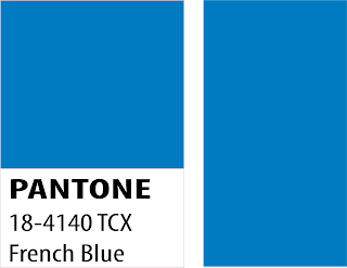
french blue
French Blue
French blue- 18- 4140 TCX. 
A stirring blue that awakens a vision of Paris in the springtime.
It has a good tonality- rich and warm- an excellent foil for lighter colors used and a good compliment for stone and marble surfaces.

How do you mix French Blue?
Mix four parts of white, one of green and four of ultramarine blue.


Spring Summer Color Palette 2021:

green ash


Green Ash color-13-0117 TCX.

A mentholated Green that cools and soothes.


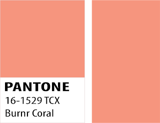
burnt coral

Burnt Coral color- 16-1529 TCX. 

Inviting burnt coral expresses conviviality.


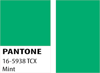
mint

Mint color- 16-5938 TCX. 

Tasty mint refreshes and restores.


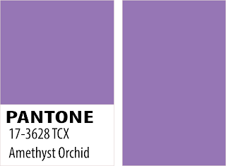
Amethyst Orchid
Amethyst Orchid- 17- 3628 TCX.

 The floral shaded amethyst orchid represents a unique touch.

Spring Summer Color Palette 2021:
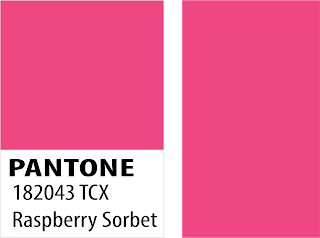
Raspberry sorbet

Raspberry sorbet- 18-2043 TCX. 

Vivifying Raspberry Sorbet tantalizes.


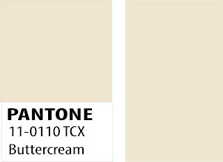
Buttercream color
Buttercream color- 11-0110 TCX. 
Smooth Buttercream is an effortless delicious off-white. 


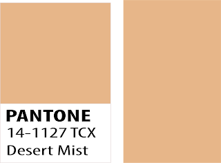
Desert Mist

Desert Mist- 14-1127 TCX. Invoking images of shifting powdery sands.


Willow color

Willow color-16-0632 TCX.

 A canopy of green that reveals and also conceals.